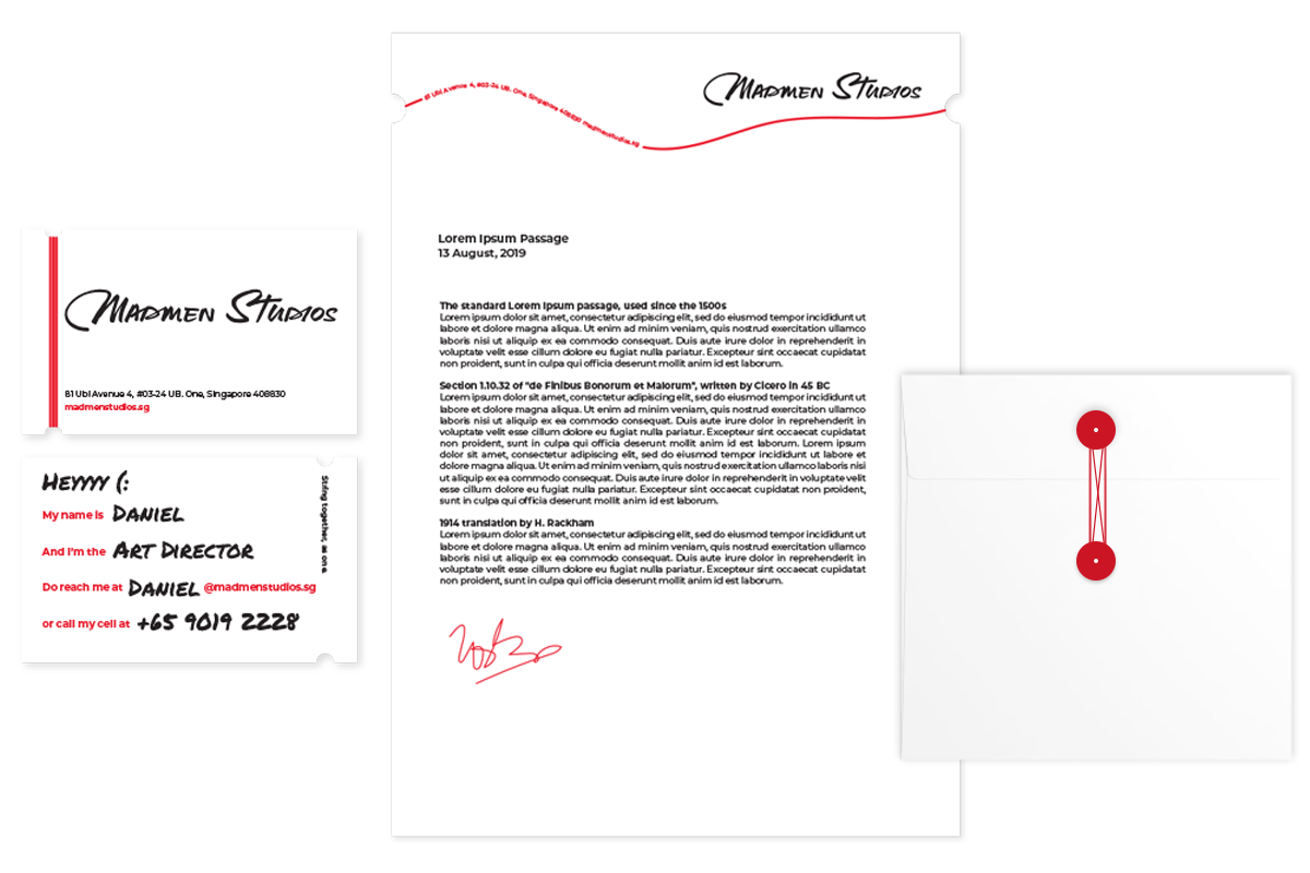
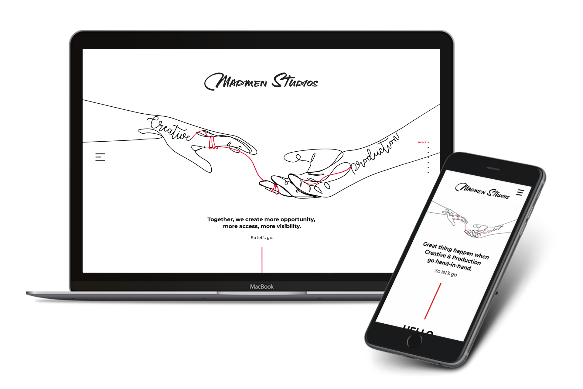
Madmen Studio, a locally-based production agency, is embarking on a company rebranding initiative. The new identity highlights the integration of Madmen Studio's diverse workforce, with the creative and production teams now united under one roof.
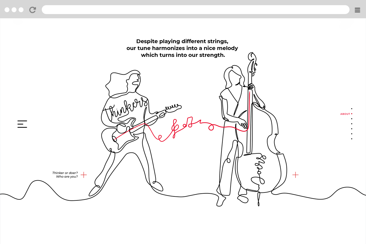
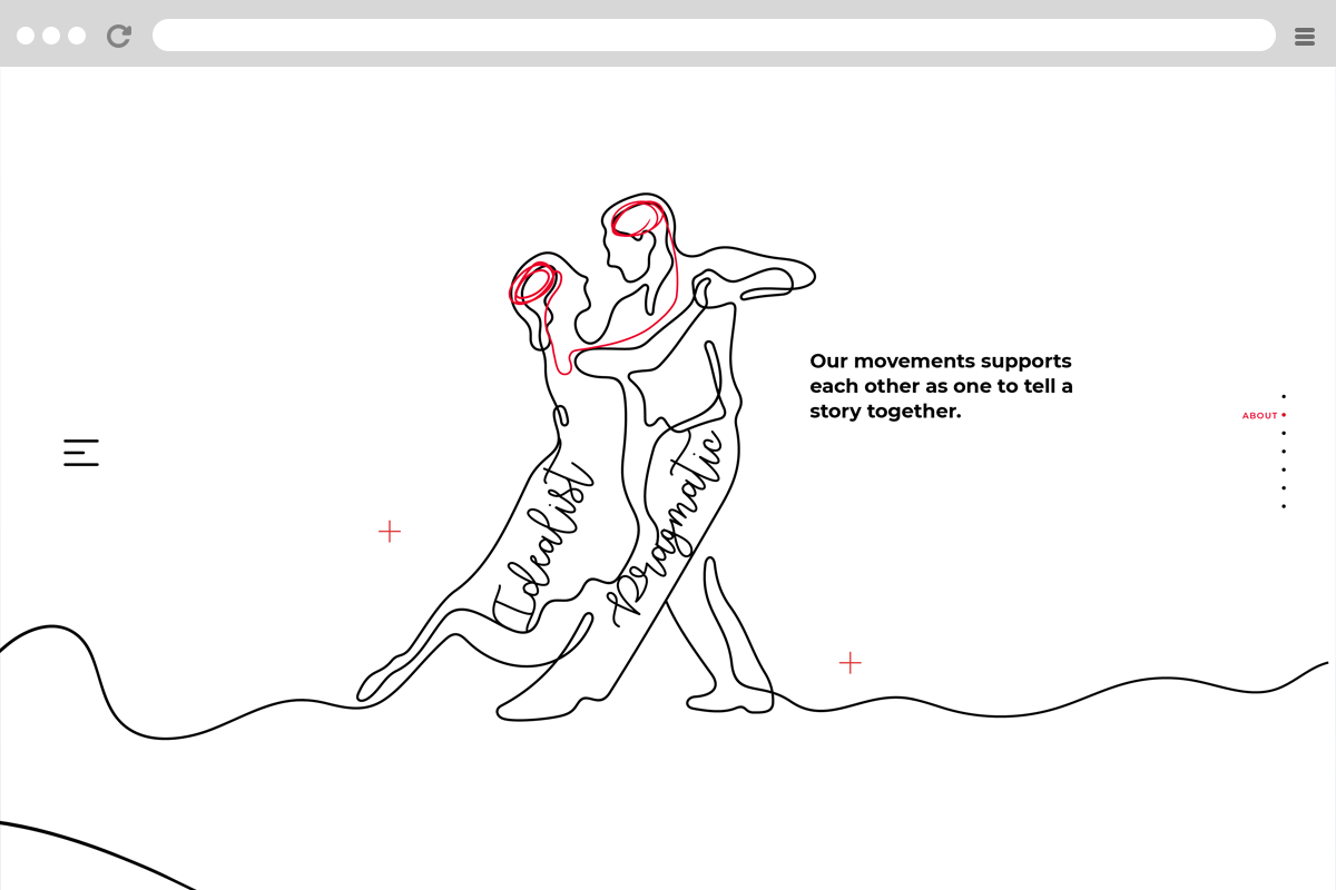
The rebranding concept revolves around the red thread, inspired by the Chinese belief that individuals connected by a red thread are destined to be partners or soulmates, regardless of time, place, or circumstance. This red thread symbolizes the connection between dreamers (creatives) and doers (production), forming an empowered dream team where new chemistry fosters greater creative ideas and enhances agility in production for more effective campaigns.
The red thread will be a core design element across all company assets, including the website, business stationery, PowerPoint presentations, and more.
Client Name : Madmen Studios
Channel : Website & Prints
Project date: September, 2019
Task Roles: Ideation, Art Director, Coding


